


Why Your Vision Board Aesthetic Matters More Than You Think

Want to try this at home? No worries! Download a copy of our SMART Goals PDF Worksheet.
****
A vision board aesthetic is not about creativity or self-expression. It’s about usability.
Most people choose an aesthetic based on what looks good in the moment. The problem is that what looks interesting isn’t always what stays useful. If your board feels visually loud, cluttered, or mismatched with your real environment, your brain will eventually treat it like background noise.
In our original roundup of vision board ideas, we highlighted clean and simple layouts, and now we’re diving deeper into how your vision board aesthetic affects whether you actually keep coming back to it.
The goal of this step is simple: choose an aesthetic your mind won’t tune out.
Need some in depth help with goal settings, motivation or productivity ? Drop on by our directories choc full of productivity coaches, accountability coaches, and goal-setting coaches, and start reaching those goals! Or click here to have us match you to the best.
Why Aesthetic Matters More Than You Think

Your brain filters visual information constantly. Anything that feels chaotic, overly detailed, or out of place gets deprioritized over time.
If you want to get more from your life, and are looking for concrete action steps to get you there, check out our Request a Coach page. It’s a “cut the fence-sitting and take action” way to tackle your issues and actually find success. To get off the fence and start to take action, click or tap here.
This is why many vision boards feel exciting at first and then slowly disappear from awareness. It’s not a motivation issue. It’s a design issue.
A good vision board aesthetic:
- Is easy to look at repeatedly
- Blends naturally into your daily environment
- Supports focus instead of competing for attention
If the board requires effort to visually process, you won’t use it.
Start With Where the Board Will Live
Before choosing colors, layouts, or styles, decide where this board will exist in real life.
Ask yourself:
- Will this be a digital board on my phone or computer?
- Will it be printed and placed near my workspace?
- Will it live inside a planner or binder?
- Will it be on a wall I see every day?

Placement determines complexity.
Digital boards need to be extremely simple. They’re often seen quickly, in motion, or alongside other tasks. If the layout is dense, you’ll stop noticing it.
Physical boards can handle slightly more texture, but restraint still matters. Just because you have space doesn’t mean you should fill it.
If you want to get more from your life, and are looking for concrete action steps to get you there, check out our Request a Coach page. It’s a “cut the fence-sitting and take action” way to tackle your issues and actually find success. To get off the fence and start to take action, click or tap here.
Let function dictate form.
Choose One Dominant Visual Style

A vision board works best when it follows one clear visual language.
This includes:
- A consistent color range (light, dark, neutral, or high contrast)
- A single lighting style (bright, soft, shadowed, natural)
- One overall tone (clean, grounded, quiet, focused)
Do not mix aesthetics.
Mixed styles feel interesting at first, but they create visual fatigue over time. Your brain has to keep recalibrating what it’s looking at, which reduces the board’s effectiveness.
Consistency is what makes a board feel stable and usable.
Match the Board to Your Real Environment
Your vision board should feel like it belongs in your life, not like it came from somewhere else.

Look at your actual surroundings:
If you want to get more from your life, and are looking for concrete action steps to get you there, check out our Request a Coach page. It’s a “cut the fence-sitting and take action” way to tackle your issues and actually find success. To get off the fence and start to take action, click or tap here.
- Your home
- Your workspace
- Your daily tools
If those spaces are neutral and minimal, a loud, high-contrast board will feel intrusive.
If your life already feels busy, your board should not add visual pressure.
This doesn’t mean your board has to look exactly like your environment. It means it shouldn’t fight it.
The easier it is for the board to visually coexist with your life, the more often you’ll actually notice it.
Limit Your Color Palette
More color does not equal more inspiration.
In most cases, two to three main colors are enough. This keeps your attention focused and reduces visual noise.
A limited palette:
- Makes images feel cohesive
- Helps your eye move calmly across the board
- Keeps the board readable at a glance
If everything stands out, nothing does.

Use White Space on Purpose
You do not need to fill every inch of the board.
If you want to get more from your life, and are looking for concrete action steps to get you there, check out our Request a Coach page. It’s a “cut the fence-sitting and take action” way to tackle your issues and actually find success. To get off the fence and start to take action, click or tap here.
Empty space is not wasted space. It gives your brain room to process what’s there.
White space:
- Reduces cognitive load
- Makes important images easier to notice
- Keeps the board from feeling overwhelming
If your board feels crowded, remove elements until it breathes again.

Avoid Magazine-Style Layouts
If your vision board looks like a magazine spread, it’s a sign the aesthetic needs adjustment.
Magazine layouts are designed to grab attention briefly, not to be revisited daily. They rely on visual novelty, contrast, and density. Those qualities don’t age well in a personal planning tool.
A usable vision board feels more like a reference than a feature.
If you find yourself admiring the board instead of absorbing it, simplify.

Check for Visual Fatigue Before Moving On
Before selecting images or finalizing the board, pause and assess the aesthetic on its own.
If you want to get more from your life, and are looking for concrete action steps to get you there, check out our Request a Coach page. It’s a “cut the fence-sitting and take action” way to tackle your issues and actually find success. To get off the fence and start to take action, click or tap here.
Ask:
- Does this feel calm to look at repeatedly?
- Does it blend into my environment naturally?
- Would I still want to see this six months from now?
If the answer is no, adjust now. It’s much easier to refine the aesthetic before adding content than after.
Why This Step Comes Before Image Selection

Want to try this at home? No worries! Download a copy of our SMART Goals PDF Worksheet.
Need some in depth help with goal settings, motivation or productivity ? Drop on by our directories choc full of productivity coaches, accountability coaches, and goal-setting coaches, and start reaching those goals! Or click here to have us match you to the best.
Aesthetic is the container. Images are the content.
If the container isn’t right, even the best images won’t work well. They’ll feel disjointed, distracting, or out of place.
When the aesthetic supports focus:
- Image selection becomes easier
- The board feels cohesive
- The board stays relevant longer
This step isn’t about taste. It’s about creating a visual system your brain can return to without effort.
If you want to get more from your life, and are looking for concrete action steps to get you there, check out our Request a Coach page. It’s a “cut the fence-sitting and take action” way to tackle your issues and actually find success. To get off the fence and start to take action, click or tap here.
If you want to get more from your life, and are looking for concrete action steps to get you there, check out our Request a Coach page. It’s a “cut the fence-sitting and take action” way to tackle your issues and actually find success. To get off the fence and start to take action, click or tap here.
Read this next
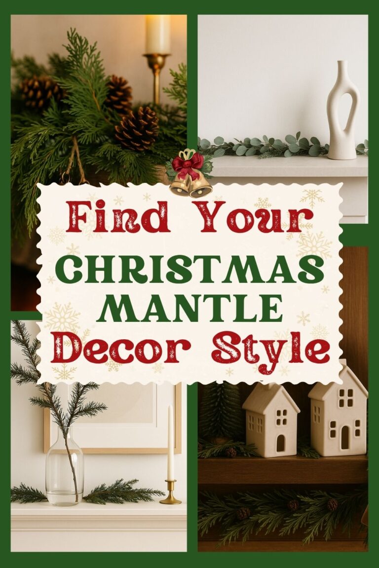
Rustic, Modern, Farmhouse or Minimalist? What’s Your Christmas Mantle Style
Are you all about style, decor and organization? Download a copy of our Decluttering Workbook. **** The mantle is the fastest way to make a room feel like Christmas without […]
Read More
Clutter Coaching: The “Touch it Once” Rule
There’s lots of types of clutter and lots of ways it can pile up. The Touch It Once strategy works well for keeping down mail clutter— either paper mail or […]
Read More
4 Vintage Christmas Decorating Styles to Steal This Year: Victorian Elegance, Retro Glow, 70s Warmth, 90s Cheer
Are you all about style, decor and organization? Download a copy of our Decluttering Workbook. The Magic of Vintage Christmas Every holiday season, we feel that pull toward something familiar […]
Read More